Readers’ Images
Annabel Williams takes a look at a selection of our reader’s Masterclass images and offers some practical advice
Jennifer Peel

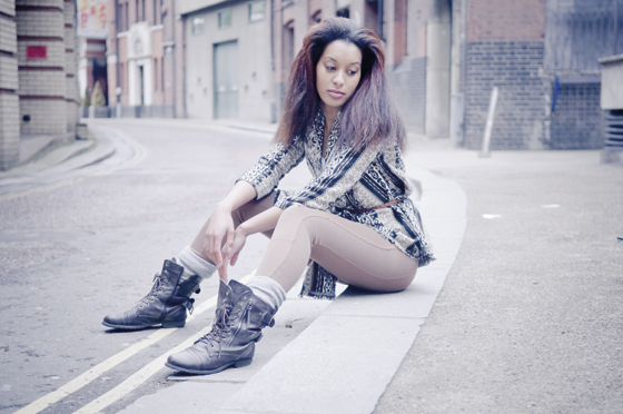
I’m particularly fond of the muted colours in this image. Jennifer has
managed to use the buildings behind the model to add another level. The
tones and textures complement her hair perfectly. Plus I’m in love with
those wonderful boots!

This is definitely an unusual composition, but I have to say it works
really quite well.
I like the way the model is looking up, and the
buildings in the background towering above her give the image a real
sense of scale.
I think this shot is gorgeous. The light is beautiful because the model
is standing under a roof that is creating really good top shade and soft
light. I love the out-of-focus café scene in the background, and I
particularly like the blurred edge on the left of the picture, which is a
curved wall. I think this really helps to make us focus on the model.
The blurred wall also links with the lights at the top right of the
shot, which helps to balance the photograph.

Isobel Murphy
Izzy has captured a really great moment here and has managed to make
the shot look spontaneous, even though we asked the model to do this
several times. The model looks really happy, and it makes the shot a lot
of fun. I also love the out-of-focus texture and the colour of the
background in the top right of the picture. It’s amazing to think it’s
just a café window at the end of a subway.
 ‘A
‘A
good tip is to experiment with different camera angles. Just tilting
your frame slightly can add a real dimension to your photographs’

What really stands out in this shot is the fact that Isobel has tilted
the camera to achieve a dynamic effect. That’s a good tip – to
experiment with different camera angles.
Just tilting your frame
slightly can add a real dimension to your photographs. Also, the
positioning of the model looks great with the columns towering above
her.
This is a great shot. I’m particularly in love the model’s hair colour and
the way that it works with the brick wall behind her. I’m also struck by
the way Izzy has faded out the right side of the picture to emphasise
the model. The composition works really well and, most importantly, the
model looks incredibly relaxed.


